How to migrate bootstrap 3 to 4

Stable changes

Moving from Beta 3 to our stable v4.0 release, there are no breaking changes, but there are some notable changes.

Printing

  • Fixed broken print utilities. Previously, using a .d-print-* class would unexpectedly overrule any other .d-* class. Now, they match our other display utilities and only apply to that media (@media print).
  • Expanded available print display utilities to match other utilities. Beta 3 and older only had blockinline-blockinline, and none. Stable v4 added flexinline-flextabletable-row, and table-cell.
  • Fixed print preview rendering across browsers with new print styles that specify @page size.

Beta 3 changes

While Beta 2 saw the bulk of our breaking changes during the beta phase, but we still have a few that needed to be addressed in the Beta 3 release. These changes apply if you’re updating to Beta 3 from Beta 2 or any older version of Bootstrap.

Miscellaneous

  • Removed the unused $thumbnail-transition variable. We weren’t transitioning anything, so it was just extra code.
  • The npm package no longer includes any files other than our source and dist files; if you relied on them and were running our scripts via the node_modules folder, you should adapt your workflow.

Forms

  • Rewrote both custom and default checkboxes and radios. Now, both have matching HTML structure (outer <div> with sibling <input> and <label>) and the same layout styles (stacked default, inline with modifier class). This allows us to style the label based on the input’s state, simplifying support for the disabled attribute (previously requiring a parent class) and better supporting our form validation.As part of this, we’ve changed the CSS for managing multiple background-images on custom form checkboxes and radios. Previously, the now removed .custom-control-indicator element had the background color, gradient, and SVG icon. Customizing the background gradient meant replacing all of those every time you needed to change just one. Now, we have .custom-control-label::before for the fill and gradient and .custom-control-label::after handles the icon.To make a custom check inline, add .custom-control-inline.
  • Updated selector for input-based button groups. Instead of [data-toggle="buttons"] { } for style and behavior, we use the data attribute just for JS behaviors and rely on a new .btn-group-toggle class for styling.
  • Removed .col-form-legend in favor of a slightly improved .col-form-label. This way .col-form-label-sm and .col-form-label-lg can be used on <legend> elements with ease.
  • Custom file inputs received a change to their $custom-file-text Sass variable. It’s no longer a nested Sass map and now only powers one string—the Browse button as that is now the only pseudo-element generated from our Sass. The Choose file text now comes from the .custom-file-label.

Input groups

  • Input group addons are now specific to their placement relative to an input. We’ve dropped .input-group-addon and .input-group-btn for two new classes, .input-group-prepend and .input-group-append. You must explicitly use an append or a prepend now, simplifying much of our CSS. Within an append or prepend, place your buttons as they would exist anywhere else, but wrap text in .input-group-text.
  • Validation styles are now supported, as are multiple inputs (though you can only validate one input per group).
  • Sizing classes must be on the parent .input-group and not the individual form elements.

Beta 2 changes

While in beta, we aim to have no breaking changes. However, things don’t always go as planned. Below are the breaking changes to bear in mind when moving from Beta 1 to Beta 2.

Breaking

  • Removed $badge-color variable and its usage on .badge. We use a color contrast function to pick a color based on the background-color, so the variable is unnecessary.
  • Renamed grayscale() function to gray() to avoid breaking conflict with the CSS native grayscale filter.
  • Renamed .table-inverse.thead-inverse, and .thead-default to .*-dark and .*-light, matching our color schemes used elsewhere.
  • Responsive tables now generate classes for each grid breakpoint. This breaks from Beta 1 in that the .table-responsive you’ve been using is more like .table-responsive-md. You may now use .table-responsive or .table-responsive-{sm,md,lg,xl} as needed.
  • Dropped Bower support as the package manager has been deprecated for alternatives (e.g., Yarn or npm). See bower/bower#2298 for details.
  • Bootstrap still requires jQuery 1.9.1 or higher, but you’re advised to use version 3.x since v3.x’s supported browsers are the ones Bootstrap supports plus v3.x has some security fixes.
  • Removed the unused .form-control-label class. If you did make use of this class, it was duplicate of the .col-form-label class that vertically centered a <label> with it’s associated input in horizontal form layouts.
  • Changed the color-yiq from a mixin that included the color property to a function that returns a value, allowing you to use it for any CSS property. For example, instead of color-yiq(#000), you’d write color: color-yiq(#000);.

Highlights

  • Introduced new pointer-events usage on modals. The outer .modal-dialog passes through events with pointer-events: none for custom click handling (making it possible to just listen on the .modal-backdrop for any clicks), and then counteracts it for the actual .modal-content with pointer-events: auto.

Summary

Here are the big ticket items you’ll want to be aware of when moving from v3 to v4.

Browser support

  • Dropped IE8, IE9, and iOS 6 support. v4 is now only IE10+ and iOS 7+. For sites needing either of those, use v3.
  • Added official support for Android v5.0 Lollipop’s Browser and WebView. Earlier versions of the Android Browser and WebView remain only unofficially supported.

Global changes

  • Flexbox is enabled by default. In general this means a move away from floats and more across our components.
  • Switched from Less to Sass for our source CSS files.
  • Switched from px to rem as our primary CSS unit, though pixels are still used for media queries and grid behavior as device viewports are not affected by type size.
  • Global font-size increased from 14px to 16px.
  • Revamped grid tiers to add a fifth option (addressing smaller devices at 576px and below) and removed the -xs infix from those classes. Example: .col-6.col-sm-4.col-md-3.
  • Replaced the separate optional theme with configurable options via SCSS variables (e.g., $enable-gradients: true).
  • Build system overhauled to use a series of npm scripts instead of Grunt. See package.json for all scripts, or our project readme for local development needs.
  • Non-responsive usage of Bootstrap is no longer supported.
  • Dropped the online Customizer in favor of more extensive setup documentation and customized builds.
  • Added dozens of new utility classes for common CSS property-value pairs and margin/padding spacing shortcuts.

Grid system

  • Moved to flexbox.
    • Added support for flexbox in the grid mixins and predefined classes.
    • As part of flexbox, included support for vertical and horizontal alignment classes.
  • Updated grid class names and a new grid tier.
    • Added a new sm grid tier below 768px for more granular control. We now have xssmmdlg, and xl. This also means every tier has been bumped up one level (so .col-md-6 in v3 is now .col-lg-6 in v4).
    • xs grid classes have been modified to not require the infix to more accurately represent that they start applying styles at min-width: 0 and not a set pixel value. Instead of .col-xs-6, it’s now .col-6. All other grid tiers require the infix (e.g., sm).
  • Updated grid sizes, mixins, and variables.
    • Grid gutters now have a Sass map so you can specify specific gutter widths at each breakpoint.
    • Updated grid mixins to utilize a make-col-ready prep mixin and a make-col to set the flex and max-width for individual column sizing.
    • Changed grid system media query breakpoints and container widths to account for new grid tier and ensure columns are evenly divisible by 12 at their max width.
    • Grid breakpoints and container widths are now handled via Sass maps ($grid-breakpoints and $container-max-widths) instead of a handful of separate variables. These replace the @screen-* variables entirely and allow you to fully customize the grid tiers.
    • Media queries have also changed. Instead of repeating our media query declarations with the same value each time, we now have @include media-breakpoint-up/down/only. Now, instead of writing @media (min-width: @screen-sm-min) { ... }, you can write @include media-breakpoint-up(sm) { ... }.

Components

  • Dropped panels, thumbnails, and wells for a new all-encompassing component, cards.
  • Dropped the Glyphicons icon font. If you need icons, some options are:
  • Dropped the Affix jQuery plugin.
    • We recommend using position: sticky instead. See the HTML5 Please entry for details and specific polyfill recommendations. One suggestion is to use an @supports rule for implementing it (e.g., @supports (position: sticky) { ... })/
    • If you were using Affix to apply additional, non-position styles, the polyfills might not support your use case. One option for such uses is the third-party ScrollPos-Styler library.
  • Dropped the pager component as it was essentially slightly customized buttons.
  • Refactored nearly all components to use more un-nested class selectors instead of over-specific children selectors.

By component

This list highlights key changes by component between v3.x.x and v4.0.0.

Reboot

New to Bootstrap 4 is the Reboot, a new stylesheet that builds on Normalize with our own somewhat opinionated reset styles. Selectors appearing in this file only use elements—there are no classes here. This isolates our reset styles from our component styles for a more modular approach. Some of the most important resets this includes are the box-sizing: border-box change, moving from em to rem units on many elements, link styles, and many form element resets.

Typography

  • Moved all .text- utilities to the _utilities.scss file.
  • Dropped .page-header as its styles can be applied via utilities.
  • .dl-horizontal has been dropped. Instead, use .row on <dl> and use grid column classes (or mixins) on its <dt> and <dd> children.
  • Redesigned blockquotes, moving their styles from the <blockquote> element to a single class, .blockquote. Dropped the .blockquote-reverse modifier for text utilities.
  • .list-inline now requires that its children list items have the new .list-inline-item class applied to them.

Images

  • Renamed .img-responsive to .img-fluid.
  • Renamed .img-rounded to .rounded
  • Renamed .img-circle to .rounded-circle

Tables

  • Nearly all instances of the > selector have been removed, meaning nested tables will now automatically inherit styles from their parents. This greatly simplifies our selectors and potential customizations.
  • Renamed .table-condensed to .table-sm for consistency.
  • Added a new .table-inverse option.
  • Added table header modifiers: .thead-default and .thead-inverse.
  • Renamed contextual classes to have a .table--prefix. Hence .active.success.warning.danger and .info to .table-active.table-success.table-warning.table-danger and .table-info.

Forms

  • Moved element resets to the _reboot.scss file.
  • Renamed .control-label to .col-form-label.
  • Renamed .input-lg and .input-sm to .form-control-lg and .form-control-sm, respectively.
  • Dropped .form-group-* classes for simplicity’s sake. Use .form-control-* classes instead now.
  • Dropped .help-block and replaced it with .form-text for block-level help text. For inline help text and other flexible options, use utility classes like .text-muted.
  • Dropped .radio-inline and .checkbox-inline.
  • Consolidated .checkbox and .radio into .form-check and the various .form-check-* classes.
  • Horizontal forms overhauled:
    • Dropped the .form-horizontal class requirement.
    • .form-group no longer applies styles from the .row via mixin, so .row is now required for horizontal grid layouts (e.g., <div class="form-group row">).
    • Added new .col-form-label class to vertically center labels with .form-controls.
    • Added new .form-row for compact form layouts with the grid classes (swap your .row for a .form-row and go).
  • Added custom forms support (for checkboxes, radios, selects, and file inputs).
  • Replaced .has-error.has-warning, and .has-success classes with HTML5 form validation via CSS’s :invalid and :valid pseudo-classes.
  • Renamed .form-control-static to .form-control-plaintext.

Buttons

  • Renamed .btn-default to .btn-secondary.
  • Dropped the .btn-xs class entirely as .btn-sm is proportionally much smaller than v3’s.
  • The stateful button feature of the button.js jQuery plugin has been dropped. This includes the $().button(string) and $().button('reset') methods. We advise using a tiny bit of custom JavaScript instead, which will have the benefit of behaving exactly the way you want it to.
    • Note that the other features of the plugin (button checkboxes, button radios, single-toggle buttons) have been retained in v4.
  • Change buttons’ [disabled] to :disabled as IE9+ supports :disabled. However fieldset[disabled] is still necessary because native disabled fieldsets are still buggy in IE11.

Button group

  • Rewrote component with flexbox.
  • Removed .btn-group-justified. As a replacement you can use <div class="btn-group d-flex" role="group"></div> as a wrapper around elements with .w-100.
  • Dropped the .btn-group-xs class entirely given removal of .btn-xs.
  • Removed explicit spacing between button groups in button toolbars; use margin utilities now.
  • Improved documentation for use with other components.
  • Switched from parent selectors to singular classes for all components, modifiers, etc.
  • Simplified dropdown styles to no longer ship with upward or downward facing arrows attached to the dropdown menu.
  • Dropdowns can be built with <div>s or <ul>s now.
  • Rebuilt dropdown styles and markup to provide easy, built-in support for <a> and <button> based dropdown items.
  • Renamed .divider to .dropdown-divider.
  • Dropdown items now require .dropdown-item.
  • Dropdown toggles no longer require an explicit <span class="caret"></span>; this is now provided automatically via CSS’s ::after on .dropdown-toggle.

Grid system

  • Added a new 576px grid breakpoint as sm, meaning there are now five total tiers (xssmmdlg, and xl).
  • Renamed the responsive grid modifier classes from .col-{breakpoint}-{modifier}-{size} to .{modifier}-{breakpoint}-{size} for simpler grid classes.
  • Dropped push and pull modifier classes for the new flexbox-powered order classes. For example, instead of .col-8.push-4 and .col-4.pull-8, you’d use .col-8.order-2 and .col-4.order-1.
  • Added flexbox utility classes for grid system and components.

List groups

  • Rewrote component with flexbox.
  • Replaced a.list-group-item with an explicit class, .list-group-item-action, for styling link and button versions of list group items.
  • Added .list-group-flush class for use with cards.
  • Rewrote component with flexbox.
  • Given move to flexbox, alignment of dismiss icons in the header is likely broken as we’re no longer using floats. Floated content comes first, but with flexbox that’s no longer the case. Update your dismiss icons to come after modal titles to fix.
  • The remote option (which could be used to automatically load and inject external content into a modal) and the corresponding loaded.bs.modal event were removed. We recommend instead using client-side templating or a data binding framework, or calling jQuery.load yourself.
  • Rewrote component with flexbox.
  • Dropped nearly all > selectors for simpler styling via un-nested classes.
  • Instead of HTML-specific selectors like .nav > li > a, we use separate classes for .navs, .nav-items, and .nav-links. This makes your HTML more flexible while bringing along increased extensibility.

The navbar has been entirely rewritten in flexbox with improved support for alignment, responsiveness, and customization.

  • Responsive navbar behaviors are now applied to the .navbar class via the required .navbar-expand-{breakpoint} where you choose where to collapse the navbar. Previously this was a Less variable modification and required recompiling.
  • .navbar-default is now .navbar-light, though .navbar-dark remains the same. One of these is required on each navbar. However, these classes no longer set background-colors; instead they essentially only affect color.
  • Navbars now require a background declaration of some kind. Choose from our background utilities (.bg-*) or set your own with the light/inverse classes above for mad customization.
  • Given flexbox styles, navbars can now use flexbox utilities for easy alignment options.
  • .navbar-toggle is now .navbar-toggler and has different styles and inner markup (no more three <span>s).
  • Dropped the .navbar-form class entirely. It’s no longer necessary; instead, just use .form-inline and apply margin utilities as necessary.
  • Navbars no longer include margin-bottom or border-radius by default. Use utilities as necessary.
  • All examples featuring navbars have been updated to include new markup.

Pagination

  • Rewrote component with flexbox.
  • Explicit classes (.page-item.page-link) are now required on the descendants of .paginations
  • Dropped the .pager component entirely as it was little more than customized outline buttons.
  • An explicit class, .breadcrumb-item, is now required on the descendants of .breadcrumbs

Labels and badges

  • Consolidated .label and .badge to disambiguate from the <label> element and simplify related components.
  • Added .badge-pill as modifier for rounded “pill” look.
  • Badges are no longer floated automatically in list groups and other components. Utility classes are now required for that.
  • .badge-default has been dropped and .badge-secondary added to match component modifier classes used elsewhere.

Panels, thumbnails, and wells

Dropped entirely for the new card component.

Panels

  • .panel to .card, now built with flexbox.
  • .panel-default removed and no replacement.
  • .panel-group removed and no replacement. .card-group is not a replacement, it is different.
  • .panel-heading to .card-header
  • .panel-title to .card-title. Depending on the desired look, you may also want to use heading elements or classes (e.g. <h3>.h3) or bold elements or classes (e.g. <strong><b>.font-weight-bold). Note that .card-title, while similarly named, produces a different look than .panel-title.
  • .panel-body to .card-body
  • .panel-footer to .card-footer
  • .panel-primary.panel-success.panel-info.panel-warning, and .panel-danger have been dropped for .bg-.text-, and .border utilities generated from our $theme-colors Sass map.

Progress

  • Replaced contextual .progress-bar-* classes with .bg-* utilities. For example, class="progress-bar progress-bar-danger" becomes class="progress-bar bg-danger".
  • Replaced .active for animated progress bars with .progress-bar-animated.
  • Overhauled the entire component to simplify design and styling. We have fewer styles for you to override, new indicators, and new icons.
  • All CSS has been un-nested and renamed, ensuring each class is prefixed with .carousel-.
    • For carousel items, .next.prev.left, and .right are now .carousel-item-next.carousel-item-prev.carousel-item-left, and .carousel-item-right.
    • .item is also now .carousel-item.
    • For prev/next controls, .carousel-control.right and .carousel-control.left are now .carousel-control-next and .carousel-control-prev, meaning they no longer require a specific base class.
  • Removed all responsive styling, deferring to utilities (e.g., showing captions on certain viewports) and custom styles as needed.
  • Removed image overrides for images in carousel items, deferring to utilities.
  • Tweaked the Carousel example to include the new markup and styles.

Tables

  • Removed support for styled nested tables. All table styles are now inherited in v4 for simpler selectors.
  • Added inverse table variant.

Utilities

  • Display, hidden, and more:
    • Made display utilities responsive (e.g., .d-none and d-{sm,md,lg,xl}-none).
    • Dropped the bulk of .hidden-* utilities for new display utilities. For example, instead of .hidden-sm-up, use .d-sm-none. Renamed the .hidden-print utilities to use the display utility naming scheme. More info under the Responsive utilities section of this page.
    • Added .float-{sm,md,lg,xl}-{left,right,none} classes for responsive floats and removed .pull-left and .pull-right since they’re redundant to .float-left and .float-right.
  • Type:
    • Added responsive variations to our text alignment classes .text-{sm,md,lg,xl}-{left,center,right}.
  • Alignment and spacing:
  • Clearfix updated to drop support for older browser versions.

Vendor prefix mixins

Bootstrap 3’s vendor prefix mixins, which were deprecated in v3.2.0, have been removed in Bootstrap 4. Since we use Autoprefixer, they’re no longer necessary.

Removed the following mixins: animationanimation-delayanimation-directionanimation-durationanimation-fill-modeanimation-iteration-countanimation-nameanimation-timing-functionbackface-visibilitybox-sizingcontent-columnshyphensopacityperspectiveperspective-originrotaterotateXrotateYscalescaleXscaleYskewtransform-origintransition-delaytransition-durationtransition-propertytransition-timing-functiontransition-transformtranslatetranslate3duser-select

Documentation

Our documentation received an upgrade across the board as well. Here’s the low down:

  • We’re still using Jekyll, but we have plugins in the mix:
    • bugify.rb is used to efficiently list out the entries on our browser bugs page.
    • example.rb is a custom fork of the default highlight.rb plugin, allowing for easier example-code handling.
    • callout.rb is a similar custom fork of that, but designed for our special docs callouts.
    • jekyll-toc is used to generate our table of contents.
  • All docs content has been rewritten in Markdown (instead of HTML) for easier editing.
  • Pages have been reorganized for simpler content and a more approachable hierarchy.
  • We moved from regular CSS to SCSS to take full advantage of Bootstrap’s variables, mixins, and more.

Responsive utilities

All @screen- variables have been removed in v4.0.0. Use the media-breakpoint-up()media-breakpoint-down(), or media-breakpoint-only() Sass mixins or the $grid-breakpoints Sass map instead.

Our responsive utility classes have largely been removed in favor of explicit display utilities.

  • The .hidden and .show classes have been removed because they conflicted with jQuery’s $(...).hide() and $(...).show() methods. Instead, try toggling the [hidden] attribute or use inline styles like style="display: none;" and style="display: block;".
  • All .hidden- classes have been removed, save for the print utilities which have been renamed.
    • Removed from v3: .hidden-xs .hidden-sm .hidden-md .hidden-lg .visible-xs-block .visible-xs-inline .visible-xs-inline-block .visible-sm-block .visible-sm-inline .visible-sm-inline-block .visible-md-block .visible-md-inline .visible-md-inline-block .visible-lg-block .visible-lg-inline .visible-lg-inline-block
    • Removed from v4 alphas: .hidden-xs-up .hidden-xs-down .hidden-sm-up .hidden-sm-down .hidden-md-up .hidden-md-down .hidden-lg-up .hidden-lg-down
  • Print utilities no longer start with .hidden- or .visible-, but with .d-print-.
    • Old names: .visible-print-block.visible-print-inline.visible-print-inline-block.hidden-print
    • New classes: .d-print-block.d-print-inline.d-print-inline-block.d-print-none

Rather than using explicit .visible-* classes, you make an element visible by simply not hiding it at that screen size. You can combine one .d-*-none class with one .d-*-block class to show an element only on a given interval of screen sizes (e.g. .d-none.d-md-block.d-xl-none shows the element only on medium and large devices).

Note that the changes to the grid breakpoints in v4 means that you’ll need to go one breakpoint larger to achieve the same results. The new responsive utility classes don’t attempt to accommodate less common cases where an element’s visibility can’t be expressed as a single contiguous range of viewport sizes; you will instead need to use custom CSS in such cases.

Mysqldump and mysql command for backup and restore example

*Mysqldump command for backup of databases, tables
*Mysql command for restore database
*How to take backup of mysql database?
*How to restore mysql database from backup?
*What command is used for MySQL database backup, MySQL database restore?

Aditya Kumar singh by profession he is a website developer, manage AWS or other server, also working on virtualization and server security, lots of websites has created by him currently running website is instadiet.in, delhijurix.com, task.soatechnology.net, laughingadda.com etc. you also visit adityakumarsingh.co.in to see their profile.

can you have two facebook pixels on one website

There are a few reasons why you might want to have more than one Facebook pixel on a site – but is it actually possible to do this?

Yes, you can have multiple Facebook pixels on a website.

Generally you will only have one Facebook pixel on a website, but it is possible to install multiple Facebook pixels on site if needed.

You can create multiple Facebook pixels (for example you might have a network of websites that you manage and you want a specific pixel for each) and you can also install multiple pixels on one site.

The most common ‘use case’ I’ve seen for more than one pixel on a website is where you have a pixel for your own ad account, and then an agency or 3rd party that is also providing services for your business has their pixel installed in order to seed the remarketing audiences or track the conversions they are focused on.

Whatever the reason, it is definitely possible to install more than one Facebook pixel on a website.

Here are some reasons why you only need one Facebook Pixel:

  • You simplify your ad creation – you aren’t having to choose which pixel you are optimizing around.
  • You get better results when the Pixel is “seasoned” with more traffic.  Facebook learns better with more data.
  • You maximize your retargeting by not splitting your audiences into smaller segments.

When you do need multiple Facebook Pixels

The only time you really need multiple Facebook Pixels is if you have websites with very different audiences.  For example if you have a website for your business and then you also have a website around some unrelated hobby like knitting – or standup comedy (which is on my own website, I know).

In that case, you would want different Pixels so that if Facebook is trying to optimize your conversions they know what type of person is typically opting in to your lead magnet or purchasing your product.

Facebook tracks the type of people who do go to your website or convert.  When Facebook shows your ads, they try to show ads to those type of people more likely to take the action you are optimizing around based on the history of the Pixel tracking.  And, of course, within the targeting parameters you have already set up.

If you do have different audiences, you have a couple options:

  1. Create a new Facebook ad account to separate the ads and the pixel data completely. This is the easier option in my opinion.
  2. Create a new Facebook Pixel and then make sure you select which Pixel you are using when you create the ad.  If you do this, then you must use the Facebook Business Manager.

A question that comes up often is how this works when people are running Facebook Ads for clients.  You should definitely not run Facebook Ads for clients all on one ad account because you are putting all the ads in that account at risk if the account gets shut down.

If you are running Facebook Ads for clients, you should either run them on separate Ad Accounts or run them on the Ad account of the client.

How to create additional Facebook Pixels

If you did want to create another Facebook Pixels you can do that in the Events Manager section of the Ads Manager.

Create a New Facebook Pixel

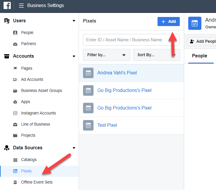
Or you can also create a new Pixel in the Business Settings of your Business Manager and then you can also assign who has access to that Pixel to use it in ads.

Business Settings Create Facebook pixel

But typical business owners will not need multiple Facebook Pixels unless they have different audiences that they are tracking and optimizing around.  

Share Button | facebook for developers

The Share button lets people add a personalized message to links before sharing on their timeline, in groups, or to their friends via a Facebook Message.

Step-by-Step

1. Choose URL or Page

Pick the URL of a website or Facebook Page you want to share.

2. Code Configurator

Paste the URL to the Code Configurator and adjust the layout of your share button. Click the Get Code button to generate your share button code.

3. Copy & Paste HTML snippet

Copy and past the snippet into the HTML of the destination website.

Full Code Example

Copy & paste the code example to your website. Adjust the value data-href to your website URL. Next use the og:*** meta tags to adjust your link preview. og:url and data-href should use the same URL.

<html>
<head>
<title>Your Website Title</title>
<!-- You can use Open Graph tags to customize link previews.
Learn more: https://developers.facebook.com/docs/sharing/webmasters -->
<meta property="og:url"           content="https://www.your-domain.com/your-page.html" />
<meta property="og:type"          content="website" />
<meta property="og:title"         content="Your Website Title" />
<meta property="og:description"   content="Your description" />
<meta property="og:image"         content="https://www.your-domain.com/path/image.jpg" />
</head>
<body>

<!-- Load Facebook SDK for JavaScript -->
<div id="fb-root"></div>
<script>(function(d, s, id) {
var js, fjs = d.getElementsByTagName(s)[0];
if (d.getElementById(id)) return;
js = d.createElement(s); js.id = id;
js.src = "https://connect.facebook.net/en_US/sdk.js#xfbml=1&version=v3.0";
fjs.parentNode.insertBefore(js, fjs);
}(document, 'script', 'facebook-jssdk'));</script>

<!-- Your share button code -->
<div class="fb-share-button" 
data-href="https://www.your-domain.com/your-page.html" 
data-layout="button_count">
</div>

</body>
</html>

source:https://developers.facebook.com/docs/plugins/share-button/

how to manage dynamic content id in facebook ads

Dynamic Ads

Dynamic Ads are ads dynamically created by populating an ad template with product information found in a data feed. This allows you to create thousands of ads without having to configure each of them individually. You can also use Dynamic Ads to target visitors based on how they have interacted with your website in the past.

The general steps for creating Dynamic Ads are:

  1. Set up conversion tracking for the specific standard events and their parameter object properties listed below, then
  2. Use the Commerce Manager to set up a dynamic ad set that targets those events

Requirements

  • You must have a Facebook Page for the business that your dynamic ads will apply to.
  • The pixel base code must already be installed.
  • You must have access to the Facebook Ads Manager.

Standard Events

Before you can set up dynamic ads, you must first be tracking the following standard events. You must also include a parameter object with specific object properties with each tracked event.

Required EventRequired Object Properties
AddToCartcontent_type and either content_ids or contents
Purchasecontent_type and either content_ids or contents
ViewContentcontent_type and either content_ids or contents

Refer to the Object Properties section below to learn what values to assign to the required object properties.

Object Properties

content_type

The content_type object property’s value must be set to either product, or product_group, depending on how you will configure your data feed when you set up your product catalog in the Commerce Manager.

If you will be tracking events associated with individual products, set the value to product. If you are tracking events associated with product groups, set it to product_group instead.

For example, here’s how you could track a visitor who has added the product with the ID 201 to a shopping cart. The ID matches the ID for that product in the product catalog.

fbq('track', 'AddToCart',
  // begin required parameter object
  {
    value: .5,
    currency: 'USD',
    content_type: 'product', // required property
    content_ids: '201' // required property, if not using 'contents' property
  }
  // end required parameter object
);

content_ids

If you are using the content_ids property in your parameter object, its value should correspond to the product ID or product IDs associated with the action. IDs must match the IDs found in your product catalog. Values can be either single IDs, or an array of IDs.

For example, here’s how to track a visitor who has added products with the IDs 201 and 301 to a shopping cart. The IDs match the IDs for those products in the product catalog.

fbq('track', 'AddToCart',
  // begin required parameter object
  {
    value: .5,
    currency: 'USD',
    content_type: 'product', // required property
    content_ids: ['201', '301'] // required property, if not using 'contents' property
  }
  // end required parameter object
);

contents

If you are using the contents property in your parameter object, in a sub-object, you must include the id property, with the product ID or product IDs as its value, and include the quantity property with a number of product items being added to cart or purchased. IDs must match the IDs found in your product catalogcontents property value must be an array of objects.

For example, here’s how to track a visitor who has added a product with the ID 301, and two products with the ID 401, to a shopping cart. The IDs match the IDs for those products in the product catalog.

fbq('track', 'AddToCart', {
  value: .5,
  currency: 'USD',
  contents: [
    {
      id: '301',
      quantity: 1
    },
    {
      id: '401',
      quantity: 2
    }],
  content_type: 'product',
});

Use the Facebook event setup tool for web

After you’ve added your Facebook pixel base code to your website, you can use the event setup tool to set up standard events and parameters without the need to code. Only standard events are available now, and not custom events.

Before you begin

  • Check that your website has a Facebook pixel installed.
  • Make sure that you have admin permissions for the pixel.
  • Turn off ad blockers in your browser.
  • Make sure that your business is not in a regulated vertical.
  • To set up content ID and content type parameters, a unique product identifier should be available either in your web page text or web page URL. For example, a product SKU or UPC. Content ID and content type parameters are only available for view content, add to cart, initiate checkout, purchase, search, add to wishlist and lead events.

Note: Facebook does not currently allow businesses in the following regulated verticals to use the event setup tool: investment banking and brokerage, insurance, financial services, retail, credit union and commercial banking, credit, financing, mortgages, pharmaceutical and health. Businesses in these verticals can set up events manually instead.

To use the event setup tool:

  1. Sign in to your Ads Manager account.
  2. Select Events Manager in the main menu.
  3. Select the pixel that you’d like to use.
  4. Click Settings.
  5. Select Open event setup tool under Event setup.
  6. Enter your URL and click Open website. The event setup tool will launch in your website browser.
  7. Click Review by each suggested event and then select Confirm or Dismiss.
  8. To add events that don’t appear in your suggested list, navigate your website as usual to find the buttons or web pages that you want. Select Track new button or Track a URL and follow the on-screen instructions.Note: When you set up an event on a button, you’re adding the event to all buttons with the same or similar text on your website.
  9. Select an event.
  10. Set up parameters for your event.
  11. Click Finish setup in the event setup tool when you’ve finished.

To view your events, go to Events Manager, select your pixel and view your event graph and table. To test that your events are firing correctly, go to Events Manager, select your pixel, click the Test events tab and follow the instructions. Learn how to use the test events tool.

print index in php twig file

The `loop` variable

Inside of a for loop block you can access some special variables:

VariableDescription
loop.indexThe current iteration of the loop. (1 indexed)
loop.index0The current iteration of the loop. (0 indexed)
loop.revindexThe number of iterations from the end of the loop (1 indexed)
loop.revindex0The number of iterations from the end of the loop (0 indexed)
loop.firstTrue if first iteration
loop.lastTrue if last iteration
loop.lengthThe number of items in the sequence
loop.parentThe parent context
{% for user in users %}
    {{ loop.index }} - {{ user.username }}
{% endfor %}